
An accordion is a user interface element that allows you to toggle between showing and hiding content sections. It is commonly used in FAQs, menus, and content-heavy pages where space optimization is essential. The accordion structure enhances readability by keeping the interface clean, organized, and interactive.
In this tutorial, we’ll walk through the step-by-step process of creating a simple yet functional accordion using HTML, CSS, and JavaScript. By the end of this guide, you will have a fully working accordion that you can customize for your projects.
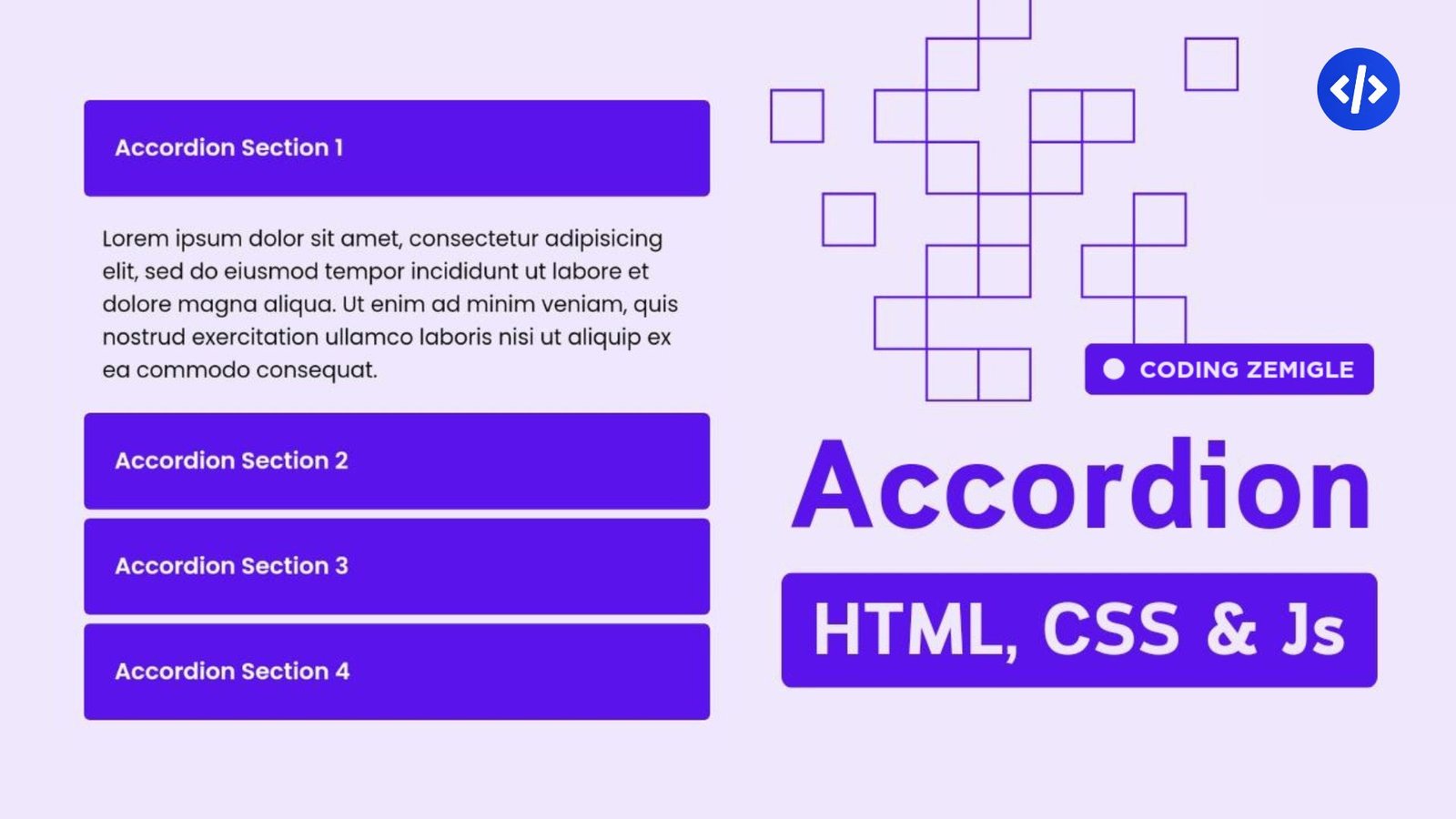
Step 01: Setting up the HTML structure of Accordion
The first step in creating an accordion is to build the HTML structure. A standard accordion consists of multiple sections, each containing a header (button) and a content panel. The header acts as a clickable element that expands or collapses the content section below it.
<!DOCTYPE html>
<html lang="en">
<head>
  <meta charset="UTF-8">
  <meta name="viewport" content="width=device-width, initial-scale=1.0">
  <meta http-equiv="X-UA-Compatible" content="ie=edge">
  <link rel="stylesheet" href="style.css">
  <title>Accordion | Coding Zemigle</title>
</head>
<body>
  <button class="accordion">Accordion Section 1</button>
  <div class="panel">
    <p>Lorem ipsum dolor sit amet, consectetur adipisicing elit, sed do eiusmod tempor incididunt ut labore et dolore magna aliqua. Ut enim ad minim veniam, quis nostrud exercitation ullamco laboris nisi ut aliquip ex ea commodo consequat.</p>
  </div>
  <button class="accordion">Accordion Section 2</button>
  <div class="panel">
    <p>Lorem ipsum dolor sit amet, consectetur adipisicing elit, sed do eiusmod tempor incididunt ut labore et dolore magna aliqua. Ut enim ad minim veniam, quis nostrud exercitation ullamco laboris nisi ut aliquip ex ea commodo consequat.</p>
  </div>
  <button class="accordion">Accordion Section 3</button>
  <div class="panel">
    <p>Lorem ipsum dolor sit amet, consectetur adipisicing elit, sed do eiusmod tempor incididunt ut labore et dolore magna aliqua. Ut enim ad minim veniam, quis nostrud exercitation ullamco laboris nisi ut aliquip ex ea commodo consequat.</p>
  </div>
  <script src="script.js"></script>
</body>
</html>
To ensure proper structure and accessibility, we use semantic HTML elements. Each accordion section should have a wrapper, inside which we place a header and a content container. The content is hidden by default, and clicking on the header reveals it dynamically.
With this basic structure in place, we now have a strong foundation for styling and interactivity. The next step is to enhance the visual appearance using CSS.
Step 02: Styling the Accordion with CSS
Now that we have the basic HTML structure, it’s time to style the accordion to make it visually appealing and user-friendly. The goal here is to give the headers a clear, clickable appearance, style the content sections, and apply transitions for smooth animations.
body{
  background: rgb(239, 231, 253);
  font-family: "Poppins", sans-serif;
  padding: 5px;
  margin-top: 50%;
}

.accordion {
  background: rgb(91, 19, 236);
  font-family: "Poppins", sans-serif;
  font-weight: 600;
  color: #fff;
  cursor: pointer;
  padding: 20px;
  margin: 2px;
  width: 100%;
  border: solid 1px;
  border-radius: 5px;
  text-align: left;
  outline: none;
  font-size: 15px;
  transition: 0.4s;
}

.active, .accordion:hover {
  background-color: rgb(91, 19, 236);
}

.panel {
  padding: 0 15px;
  display: none;
  font-size: 14px;
  background-color: transparent;
  overflow: hidden;
}
First, we need to design the accordion container to have a defined width and a subtle border for a clean layout. Each accordion item should have a distinct background, proper padding, and spacing to differentiate the sections.
The accordion headers should look like buttons but blend seamlessly with the page’s design. Applying hover effects will make it clear to users that the headers are interactive.
For the accordion content sections, they should remain hidden when the page loads. We achieve this by setting the display property to none. When the user clicks a header, the content section will be displayed smoothly using CSS transitions.
You can also add animations to make the transition fade in instead of appearing instantly. This enhances the user experience and makes the accordion feel more interactive and polished. Now that our accordion looks great, let’s make it functional by adding JavaScript to handle the toggle effect.
Step 03: Adding Interactivity with JavaScript
Without JavaScript, our accordion is just a static layout with no functionality. JavaScript allows us to toggle the content visibility when a user clicks on a header.
var acc = document.getElementsByClassName("accordion");
var i;

for (i = 0; i < acc.length; i++) {
  acc[i].addEventListener("click", function() {
    this.classList.toggle("active");
    var panel = this.nextElementSibling;''
    if (panel.style.display === "block") {
      panel.style.display = "none";
    } else {
      panel.style.display = "block";
    }
  });
}
First, we select all the accordion headers using JavaScript and attach an event listener to each one. When a user clicks a header, the script should find the corresponding content section and toggle its visibility.
To ensure a clean experience, we should also close any previously opened sections when a new one is clicked. This prevents multiple sections from being open at once and keeps the interface tidy and user-friendly.
For better performance and usability, we can enhance the script by adding ARIA attributes for accessibility. This ensures that users navigating via keyboard or screen readers can still interact with the accordion efficiently.
At this point, we now have a fully functional accordion with a clean design and smooth toggle effect. However, there’s always room for further customization to match your project’s style.
Step 04: Enhancing the Accordion with Advanced Features
Once you have the basic accordion working, you can take it a step further by adding extra features to improve usability and design.
One common enhancement is to animate the height of the content sections instead of simply toggling their display property. This can be done using CSS transitions or JavaScript animations, making the open/close effect more fluid.
Another great addition is an icon indicator next to each header, such as a plus (+) symbol that changes to a minus (-) when the section expands. This gives users a visual cue about which sections are open or closed.
You may also want to allow multiple sections to stay open simultaneously instead of automatically closing previous sections. This depends on the type of content you are displaying and how you want users to interact with it.
For mobile responsiveness, ensure that the accordion works well on smaller screens by adjusting font sizes, padding, and spacing accordingly. You can use media queries to modify styles based on different screen sizes, ensuring a seamless experience across all devices. With these enhancements, your accordion will not only be functional but also visually impressive and user-friendly.
Creating an accordion using HTML, CSS, and JavaScript is a simple yet effective way to improve your website’s usability and organization. By following the steps in this tutorial, you now have the knowledge to build a clean, responsive, and interactive accordion that can be used in various applications, from FAQs to menus and more.
Accordions help reduce clutter, enhance user experience, and present information in a structured manner. By customizing styles, adding animations, and improving accessibility, you can create an accordion that fits seamlessly into any website design.
Now that you have mastered the basics, don’t hesitate to experiment with additional features like nested accordions, dark mode themes, or even dynamic data loading using JavaScript. The possibilities are endless!
If you found this tutorial helpful, check out more web development guides. Keep coding, keep creating, and make your projects stand out!